Create a chart
1. Go to the Dashboard.
2. Choose a Dashboard.
3. Click "Add new chart" to create your first chart.
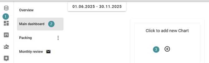
Chart configuration
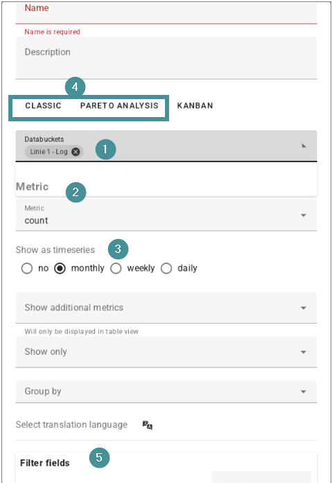
Every chart is defined by the following elements:
-
Databucket selection
-
Choose the data bucket you want the chart to use.
-
-
Metric
-
Select what you want to measure (e.g., count, downtime, etc.).
-
-
Timeseries
-
Decide whether the metric should be displayed as a total or broken down by week, month, or other time intervals.
-
-
Classic vs. Pareto charts
-
Pareto Analysis: Visualizes results from text analysis (e.g., most common issues, most frequent actions).
-
Classic charts: Standard visualizations such as counts or downtime per machine — similar to what you could build in Excel.
-
-
Filter fields
-
Choose which lines, machines, or other filter fields to include.
-
These use the same filters available in the analysis view.
-
Edit charts
6. After the chart is created, click the edit icon on the right side of the chart to adjust any charting options.
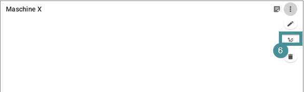
Chart types and layout
-
Bar chart
-
Line chart
-
Table view
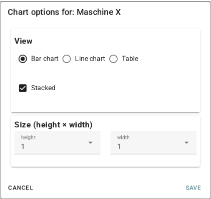
Chart size can also be adjusted. Sizes are based on tiles:
-
A dashboard is 2 tiles wide
-
Height is unlimited
Using charts, you can tailor each dashboard to highlight the metrics most important to your team.