Below is a description of how create a bar chard using selections and selection joins.
What this guide covers
1. How do I create the selections?
2. How do I create the selection joins?
3. How do I create the selection used for the chart?
4. How do I create the chart?
Create two selections
First, you need to create selections that gather the data required to create the chart.
Log in to the administrative client
1. Go to Settings and open System Settings
2. Navigate to "Selections"
3. Click Add Job and then choose Jobs

4. Go to the Output Columns tab, where you can add columns.
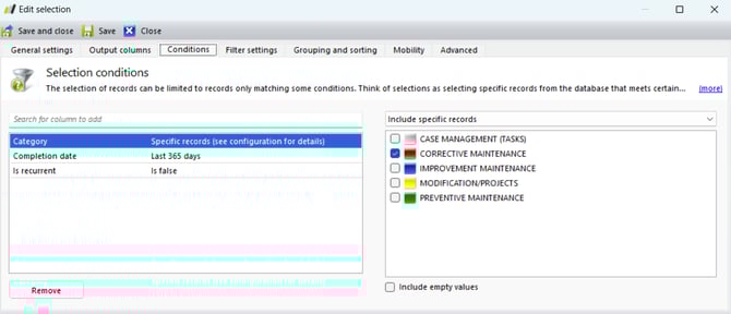
5. Go to the Conditions tab and select the columns as described below:
-
Category: Select Include specific records – check Corrective Maintenance (or the column you wish to view data for)
-
Created at: In Dynamic Date Range – Last 365 days
-
Is Recurrent: Is False

Then, create an identical selection, but instead of using the Created at category as an condition, use Completion Date.
You can also add the Completion Date column to the Output Columns.
Create two selection joins
Now we will create selection join to be able to display the data we chose to include in the selections above.
1. Go to Settings and System Settings
2. Navigate to Selections and Table Providers
3. Locate the one called "A range of dates2, then either double-click it or select it and choose Edit

4. Click Add and choose Selection join
5. Fill in the details as follows:
-
Column Name: Created # Jobs
-
Local Key Column: Date
-
Selection to Join: Choose the selection you created that contains Created Jobs
-
Remote Key Column: Created at
-
Remote Value Column: Created at
-
Function: Count
6. Click OK

7. Now we will also create one for the completed jobs
8. Fill in the details as follows:
-
Column Name: Completed # Jobs
-
Local Key Column: Date
-
Selection to Join: Choose the selection you created that contains Completed Jobs
-
Remote Key Column: Completion date
-
Remote Value Column: Completion date
-
Function: Count
9. Click OK

Crete a selection
Now we will create the selection that will be used to generate the chart
1. Go to Settings and System Settings
2. Navigate to Selections
3. Click Add and choose Information Tables and A range of dates

4. Under the General Settings tab, fill in:
-
Name
-
Description
-
Icon
-
No group – Hidden: Choose where to place your selection
-
Assigned to roles and users: Choose who should have access to your selection

5. Under the Ouput Columns tab, add the columns you created earlier.

6. Save and Close
7. Exit System Settings and find your selection in the list on the left.
Create a diagram
Create a chart that compares the created and completed jobs.
8. Click New Chart at the bottom of the selection

Fill in the following:
1. Name
2. Description
3. Data Source: This is the name of the selection you just created
4. Group By: Choose which column you want to sort by from the output columns in the selection
5. Pie Chart, Bar Chart or Line Chart: Choose the appearance of the chart
6. X-Axis Name & Y-Axis Name: What you want to label the axes
7. Add: Here you add another bar so you have both Created and Completed
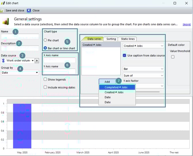
You can choose to change the color of the bars — feel free to experiment!